Showing posts with label Process. Show all posts

Monday, 28 February 2011

Judge, Jury and Executioner

Crop from "HMRC Dredd", line art in Manga Studio, colour in Photoshop

I was commissioned by Iain Winfield from Accountancy Age magazine to create the cover for this week's issue. The cover story is about HMRC (I will hugely paraphrase) throwing it's weight around.

Iain asked me to draw a fictitious "HMRC agent" dressed up like Judge Dredd in a parody of this classic poster (I think by Brian Bolland, but feel free to correct me) shown below with my photographic reference.

Reference for "HMRC Dredd"

Since the brief was very clear in terms of composition, I submitted my roughs with just a few variations in pose. I tried to suggest the Judge's uniform with the leather jacket, using a ID card as the badge and sunglasses instead of the helmet. Also I felt the gun was perhaps overtly aggressive so I delivered an option with the character being "tough" with the paperwork, which is my personal experience of HMRC.

Roughs for "HMRC Dredd". Manga Studio & Photoshop

The guys at the magazine decided that the "full on" version was the way forward so I pushed on to the final image.

"HMRC Dredd", line art in Manga Studio, colour in Photoshop


Have a great week!

Monday, 21 February 2011

The Outsider

Crop from "The Outsider–2", line art in Manga Studio, colour in Photoshop.

Right at the beginning of this year I put aside a couple of days to enter The House of Illustration and the Folio Society's inaugural competition. The prize was a commission to illustrate a new edition of "The Outsider" by Albert Camus.

Wikipedia summarises the book thusly.

"The title character is Meursault, an Algerian ("a citizen of France domiciled in North Africa, a man of the Mediterranean, an homme du midi yet one who hardly partakes of the traditional Mediterranean culture") who seemingly irrationally kills an Arab man whom he recognises in French Algiers. The story is divided into Parts One and Two: Meursault's first-person narrative view before and after the murder, respectively."

For the entry to the competition you had to submit 3 final pieces and if successful, create art for 7 images. As I read the book over Christmas I thumbnailed out likely scenes in my sketchbook as I went. Sadly I can't show you these as I am in the middle of a house move and that sketchbook is at the bottom of a box somewhere!

With the images plotted out I dived straight into research.

Reference imagery for "The Outsider – 1"

When illustrating books, I don't want to draw all the details of the scenes as I feel, especially being a more "realistic" artist, that it's important not to take away from the reader's imagination. What I wanted to achieve was the isolation of the main character in each scene, but not sadness as the isolation is his choice. The other aim of the images was to translate the heat of Algiers through the illustrations.

Final Art for "The Outsider–1". Line art in Manga Studio, colour in Photoshop.


Reference imagery for "The Outsider – 2"


Final Art for "The Outsider–2". Line art in Manga Studio, colour in Photoshop.


Reference imagery for "The Outsider – 3"


Final Art for "The Outsider–3". Line art in Manga Studio, colour in Photoshop.

Though the winner has not yet been announced, I have been informed that it wasn't me! I thoroughly enjoyed producing the art for these and I would probably have never read the wonderful book without the competition.

Have a great week!

Monday, 14 February 2011

Wired - Aliens!

Crop from "Aliens" for Wired Magazine, Art Direction Alice Cho, line art in Manga Studio, colour in Photoshop

Just as I was about to leave the house for bonfire night fireworks (yes, it was that long ago but I wasn't allowed to post until now) I was contacted by Alice Cho at Wired magazine. She commissioned me to illustrate four films, due to come out in 2011, that feature alien invasions. The films were World Invasion: Battle LA, The Thing, Paul and Cowboys & Aliens. The catch, aside from trying to fit all these films into one image, was that most of these movie's hadn't even released a publicity shot.

Reference for "Aliens"

I scavenged what reference imagery I could and produced three roughs, mainly playing off and thusly becoming a little homage to the overhead ship composition from the Cowboys & Aliens cover by (I think) Luciano Lima.

Initial roughs for "Aliens", drawn & coloured in Manga Studio

At this point the copy got cut down to only three movies (loosing the remake of The Thing) so I was asked to redraft version 3, adding in Paul from version 2 and a larger cowboy behind him to create the new rough below.

Final rough for "Aliens", drawn in Manga Studio


Final art for "Aliens", line art in Manga Studio, colour in Photoshop.

Have a great week!

Monday, 31 January 2011

Tablets and Product Photography Illustration

Detail from "Tablets", line art in Manga Studio, colour in Photoshop.

I was hired by BBC Focus to illustrate an article reviewing the new batch of tablet PC's desperate to take the iPad's crown. Working with Steve Sayers, the Art Editor on Focus, the process of the job was a bit different for me as it involved illustrating around product photography.

Steve's idea, inspired by the poster for Cecil B DeMille's 1956 film "Ten commandments", was to produce a dramatic image of a guy on a mountain carrying all the tablets. As usual I then sourced my own reference for the drawing, including the obligatory dressing gown dressing up shots... (A quick google search failed to bring up the name of the illustrator who painted this poster. If anyone knows who it was, please let me know!)

Ten Commandments poster and reference images for the final drawing.

Steve then sent me over a rough layout for me to draw over, so they could work out where the tablets would be. After deciding that the figure couldn't hold the tablets in his hands as they would be to jumbled up, I decided to go for a more fantasy angle and have the tablets "appearing" out of the lightning. I scribbled up a rough over a stock photograph in Photoshop, which was then sent to the photographer so he could shoot the tablets at the right angles.


Rough layout, drawn in Photoshop over a draft pdf of the magazine spread.

With everything approved I waited for the shots to come back for the photographer and then completed my artwork.

Final art for "Tablet", line art in Manga Studio, colour in Photoshop.

A real collaborative effort and a really striking product review spread even if I do say so myself!

Have a great week!

Monday, 6 December 2010

The Truth About Dinosaurs

Crop from Dino DPS, Line art in Manga Studio, Colour in Photoshop

I was commissioned by BBC Focus magazine to illustrate an article for the December issue on the changing nature of the "truth" about dinosaurs. As the article says, "These days barely a month goes by without a fossil find or new research challenging our assumptions about how dinosaurs lived."

For the opening double page spread the art editor suggested a drawing of the main hall of the Natural History Museum in London with the addition of a giant pair of pterodactyl wings on the large Diplodocus skeleton. Completely in love with this idea, and secretly hoping that one day a fossil is found that supports this, I was more than happy to oblige!

Dino DPS rough sketch, artwork in Manga Studio. Click to enlarge.


Dino DPS final art, line art and colour in Manga Studio with some colour overlays in Photoshop. Click to enlarge.

Accompanying the article I was also asked to create 4 half page illustrations. This image was to illustrate the idea that "until this year palaeontologists had no clear-cut evidence for the colour of dinosaurs. Illustrators made educated guesses, basing their pallets on what they know of colour in modern animals." I decided to show an adventurous illustrator painting "from life".

"True Colours" rough, artwork created in Manga Studio. Click to enlarge.

"True Colours" final art, line art and colour in Manga Studio with some colour overlays in Photoshop.
Click to enlarge.

"Think dinosaurs and you’ll likely conjure images of vast creatures tramping through sweltering swamps or fetid forests. But palaeontologists working in Alaska and Antarctica have shown that dinosaurs survived in far colder conditions than previously thought, with some species able to thrive amidst snow and ice."

"Dinos on Ice" rough, artwork created in Manga Studio.
Click to enlarge.
"Dinos on Ice" final art, line art and colour in Manga Studio with some colour overlays in Photoshop. Click to enlarge.


It also turns out that there's no such thing as a Bronotsaurus. The palaeontologist who discovered it, Othniel Charles Marsh, essentially mixed up the bones of another dinosaur, Apatosaurus ajax, which he also discovered, and thought he'd found a new species. Brontosaurus, being much more fun to pronounce has lived on in the public consciousness.


"Mistaken Identity" rough,
artwork created in Manga Studio.
Click to enlarge.
"
Mistaken Identity
" final art, line art and colour in Manga Studio.
Click to enlarge.

"They look like weapons, but many of the dinosaurs’ most impressive horns, plates and spikes may have been used more for display than destruction."
"Display not destruction" rough,
artwork created in Manga Studio.
Click to enlarge.


"
Display not destruction
" final art, line art and colour in Manga Studio.
Click to enlarge.

The magazine's in the shops now, so please do go pick up a copy to read the full story and all the other great features.

Thanks for reading and have a great week!

Monday, 19 April 2010

Nature's Most Wanted Assassins

Crop from "Most Wanted" illustration for BBC Focus magazine. Linework in Manga Studio, colour in Photoshop.

Robbie Bennie, Deputy Art Editor on BBC Focus Magazine commissioned me to produce an image for a short article on "Nature's Assassins", insects and fungus that "take out" destructive pests. Robbie gave me the concept of turning the insects and fungus into comic book style super villains in a police line up based on the famous "Usual Suspects" poster.


Rough sketch for "Most Wanted", linework in Manga Studio, colour in Photoshop.

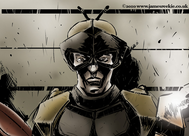
Diving in with both feet I drew up a rough based on the poster, using the same poses but designing costumes over the top. Left to right the deadly assassins are; A ladybird (Targets Aphids) , Hoverfly (Aphids and leafhoppers), Rust fungus (the rubber vine weed), Lacewing (Too many to mention) and another kind of fungus not named in the copy I was sent!

Aside from the difficulties of designing costumes based on a white mould, I was having a blast! After the ok I moved onto the final linework and colour.

Final linework, Manga Studio.


Final artwork for "Most Wanted", linework in Manga Studio, colour in Photoshop.

The article is in the May issue of Focus which I think is out now. Have a great week!

Wednesday, 27 January 2010

Colouring in Manga Studio

Crop from "Sea wreck", line art and colour in Manga Studio

On the first day I scanned in a drawing into a computer, I coloured it in Photoshop. I didn't even own a computer at the time and I was in a workshop on my art foundation course. As my education and then career continued and I experimented with animation and computer created artwork I learnt many other applications and created artwork in various different ways. However, whenever it came to colouring up my drawings I always went straight for the old faithful, Adobe Photoshop.

Early last year it became clear that I would spend some time leading a nomadic lifestyle. I realised that a scanner was not going to be travelling with me and so I had to find an alternative to drawing "for real". I tested out a few applications and found Manga Studio. I haven't looked back since. I love working digitally, I love the line quality, the quick resizing and alterations in the drawing stage, being free of piles and piles of paper and scanning and, most importantly, the blessed "undo" button.

Of course Photoshop has all these tools too, but I just liked the way Manga Studio was set up and how the tools reacted to the way I draw. The pencil and pen tools specifically just felt great from the off. To me, Photoshop is a bit clinical and just doesn't feel right for drawing.

So, after producing my line art in Manga Studio I would export the image and jump straight into Photoshop. To be honest, I'd never tried out the colour tools and completely glossed over them when learning the program.

A weeks or so ago I was asked via email, "Why don't you colour in Manga Studio?". Good question I thought. I used the excuse to upgrade to the Expert version of the software (my goodness, it's so much better! So many more tools! If you're using Debut version, seriously consider switching!) and knocked up an image to play with.
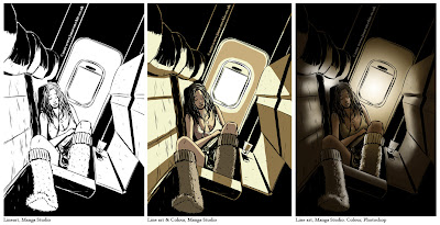
Test image. Drawn in Manga Studio, colour test in Manga Studio then Coloured using the airbrush tool in Photoshop

After penciling and inking as usual I used the Magic Marker tool to colour the image. I found it quick and easy, isolating large areas and using the pen tool to add in some detail. I then went back to the original line art and coloured as I would have done in Photoshop using gradients and the airbrush.

Initial conclusions are... well, it's a different look, more of a classic hard edge colour comic book style. I felt this was perhaps a bad test as the extreme light suited the airbrushing. I tried to get a similar effect using the blur and pencil tool but... it didn't really work!

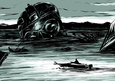
I pushed on to the first in a series of concept images I'm doing for a new project. I drew up the ink line as usual and dropped a dark slate colour over the image. I worked back into the colour using the pen tool and I must admit I am really pleased with the way this one turned out.
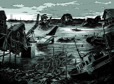
"Sea Wreck" Artwork produced in Manga Studio

In this case the hard edge really suits the image, picking out all the sea ripples and the textures on the wrecks. As with all tools, digital or otherwise, you are always learning new things about them and ways to use them. In the future I'm definitely going to play with the colour in Manga Studio more and am not going to default to Photoshop for all my colour artwork. Having said that, stick an airbrush tool in Manga Studio and Robert's your mother's brother...!

Monday, 30 November 2009

Get Me Out Of Here

Full page feature illustration crop.

Earlier this month, Steve Sayers, Art Editor on BBC focus and fast becoming my client of the year asked me to produce some illustrations for a feature in the December issue, "I'm an IG Nobel Prize Winner – Get Me Out Of Here!".

The feature asks 6 winners (see more about the prize here) how they would escape being marooned on a desert island. I won't go into too much detail about how they do it, the enterprising amongst them utilising their own creations as much as possible, but if you are keen it is a very interesting article and I suggest you pick up a copy!

As far as my drawings were concerned, Steve had sent me little stickmen roughs placed on the page layout to show how he wanted to illustrate the solutions the inventors had come up with. I simply worked these up into digital colour roughs using Manga Studio for the line work and Photoshop for the colour. Steve asked me to base the style on a "shoes" illustration from my portfolio and I think the simple line and colour gives the drawings a real "Boy's Own" feel, suiting the article to a "t".
Sketch of "Clocky" solution, Gauri Nanda turns an alarm clock into a makeshift solar powered boat to paddle for help on bamboo oars.

Upon approval I then worked up the finals, drawing the ink line digitally in Manga Studio and colouring up selected areas in Photoshop. These sparely coloured finals actually take a long time as you find yourself doing a lot of adding and deleting sections until you find the right balance.

Final "Clocky" solution.


Final "Coconut bombs" solution, Dr Elena Bodnar uses a bra to fire coconut shells filled with gunpowder to attract passing ships.


"Stink" solution, Charles Spence uses a plastic bag filled with vanilla to attract ships by smell.


"Big smoke" solution, after constructing a huge "S.O.S." sign Troy Hurtubise builds a giant fire pit to attract a rescue.


"Coin tube solution", my personal favourite, Len Fisher uses loose change to create an electric current to signal passing ships.


The full page title illustration based on the "I'm a Celebrity" TV show logo.

Monday, 9 November 2009

Vincent Price Presents "The Effigy"

So, the other project to come out of my initial round of pitch page promotion was a one shot on the "Vincent Price Presents" series for Bluewater Productions. The issue I've now completed for them is "The Effigy", written by Paul J. Salamoff, and is a classic slice of American small town horror. Scarecrows, cornfields, bullying... all the good stuff!

Inspiration and reference

One of the major discoveries I've had since starting this comic book journey is something I suspected, but perhaps I should have known. Producing lots of images on one page is just like producing one image. The process is exactly the same. Reference, sketch, final artwork. The only difference is you have to do 10 images across a spread over a couple days. As soon as you make any less effort with a panel than you would for any single image then the art suffers.

If you have a strong process as an illustrator I've found you don't tend to panic... or a least you panic less! You simply drop into your system and knuckle down. All the art for this book was 100% digital, sketched and inked in Manga Studio, coloured in Photoshop using a graphics tablet.

I always produce tonal roughs (thanks "classical" Illustration degree) as it really helps with composition and with the colour stage.

Panel Process

Final Spreads


Hopefully no spoilers there! The pages are currently being lettered and I'll let you know when the book's coming out.