Tuesday, 18 August 2009

Food Glorious Food


I was asked by the agency to create some food imagery for some potential projects. It's been years since I've concentrated on drawing a sheet of real stuff. Probably since my foundation tutor asked me to work up a whole sketchbook of drawings from life. It's been a fun challenge, but I am a little concerned I've gone a bit "dark" with the drawings... Oh well. Might have another go later in the week.

Friday, 14 August 2009

Jumpers for Goalposts


Moving into different subject matter as requested by the agency. I should be posting quite a few different things over the next week or so... depending on moving home busyness.

Thursday, 13 August 2009

Watching the rain


Kind of appropriate in the middle of an English "summer". A replacement spread for the book... maybe!

Wednesday, 12 August 2009

Office Stress


So, I screwed up with my book.

I got very confused with the online service and whether or not I should include blanks on the inside front and back of the cover.

Whatever I did, I was wrong. All the text printed one page out so all all my rectos and versos were up the swanny. A disaster! Luckily for me it turned out to be a happy one.

I had designed the book with large double spread images separated by black spreads with the text. Seeing the left hand portion of the image first created a great lead in to the image and improved the context of each image vastly. I have therefore decided to redesign the book with this in mind, adding some extra artwork on those pages.

I also decided to change a couple of spreads that weren't working. Below is one of the new images.


Onwards and upwards!

Tuesday, 11 August 2009

Look Magazine and Kleenex


One of my images was featured in this Look magazine advertorial about creating a drawing to go on a Kleenex box. It was out at some point in July.

Tuesday, 4 August 2009

What Happens When


I was contacted by Steve Sayers, Art Editor on BBC Focus Magazine, to produce 15 Illustrations for a feature on "What Happens When...", answering questions about what the body is doing when itching or blushing etc. This project was very enjoyable and I even got to sneak in a vaguely-Heath-Robinson-inspired creation along the way too! Should be out now in the August issue.

Above image: "Blushing"
"Cramp"


"Farting"


"Itching"


"Cracking Knuckles"


"Heartburn"


"Seeing Stars"


"Sensitive Teeth"


"Twitchy Eyelid"

Monday, 27 July 2009

The End

Final spread for the book. Going to finalise the layout and organise a proof print.

Thursday, 23 July 2009

Wednesday, 22 July 2009

Sleeping

Bit of an experiment for a book page using a "leaves" overlay effect. If you squint, she looks a wee bit like Cheetra.

Tuesday, 21 July 2009

Colour Process

I thought I'd give you a little insight into the colour process that I've been using lately. I guess in general it's quite traditional, but interesting to me nonetheless. I was taught to paint "properly" during my degree and I'd recommend all students to learn traditional skills, even if like me, you work 100% digitally. All my work is created using the old school processes of reference gathering, tonal studies, etc, I just use a computer to speed it all up. And the computer has the blessed "undo" feature. Anyone who paints in ink and watercolour for real, I doff my cap.

This image is from the book I'm working on. Nearly done now! Couple more to go.
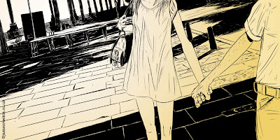
After Finishing the "ink" drawing in Manga Studio I drop a gradient layer straight across the image to create initial depth, tone and light. This layer is the final layer from the image, beefed up so you can see it clearer. As you can see I do alter some shapes as I go to get the colours right, generally after the next step.
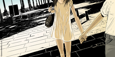
I then start adding colour in specific sections and digitally airbrush the tone on. Some areas get a "hard" treatment with the tone and colour, some soft depending on the light or the object or how I'm feeling, really!


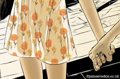
I knew I wanted to play with pattern in this image, so I loosely worked up a flower design, again painted digitally in Photoshop. The check shirt was also done in this way, draw straight in the application using brush effects.

The final image. This is the longest section of the colouring process where I add things, delete them, delete existing things and generally mess around with different colours, hues and levels until I'm happy (these examples all come from the final file, the values were all quite different initially).

The other thing I do is to shrink the image down to a thumbnail size in the view settings (a bit like walking back from the canvas to see full picture) so I can see how the tone works across the image.

And I ask the wife to tell me what she thinks. And then I stress about it. And then I stop.