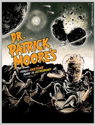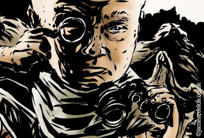
About a month or so ago Steve Sayers, the Art Editor on BBC focus Magazine asked me to produce a full page Illustration introducing a feature on a crash course in astronomy from UK TV legend Patrick Moore. I had done a feature for Focus a month or so earlier and there's no better compliment than being commissioned again so quickly.
The initial verbal brief Steve gave me was "Patrick Moore as a Mekon" which had me grinning like an idiot with the thought of spending time researching Dan Dare, one of my Sci Fi heroes. I dived straight in, gathering inspiration maniacally.
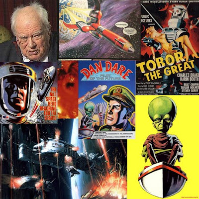
A few of the reference images I gathered.
Steve had supplied me with a rough page layout to draw over and, with a pretty clear idea of what I wanted to do, I sketched up a rough straight over the top in Manga Studio using the pencil tool. He had also requested that I do the monster movie type treatment, which I was more than happy to do.
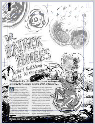
I bought the sketch into Photoshop and quickly splashed some colours over the top, adding in some background options, the one here being spaceships and colliding planets.
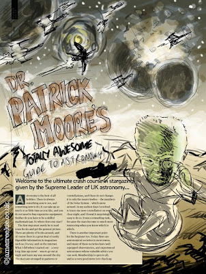
The roughs came back with the comments (paraphrased), "Wow! Loose the spaceships and green head colour. He looks like Frankenstein."
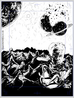
I opened the first rough in Manga Studio and inked back over the first sketch. I went for a heavier, pulp style of linework, pushing up the shadows to reflect the Eagle Comics/Pulp magazine/Monster Movie style I was going for.
I flipped the pose of the arms and sorted out the dodgy binoculars from the rough. I also decided to draw in all the mountains under the type. Now, strictly speaking this was unnecessary, but as the rough Steve supplied contained placeholder text I wanted to help the designer out (having done layout myself) and produce a completed image. This allows the text box to be set to whatever size is needed. Also, it felt better to be working on a full image, rather than with a huge lump of dead space in the centre of the illustration.
I exported the image into Photoshop and began to airbush. I always slap a gradient over the whole image, much like a watercolour wash and then add definition with a transparent toning layer on top. I also add little additional areas of colour blending down. I like to work with as minimal a palette as I can get away with and this technique allows me to keep everything together.
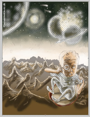
Colour with the ink layer down to 30% underneath.
For the type I tried a bunch of different options, setting in Illustrator, adjusting existing typefaces, tracing and overlaying... In the end I just sketched it out by hand (in Manga Studio again, using a dip pen tool), using movie poster references for style.
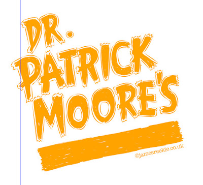
Type artwork. This was then coloured corrected and tweaked in Photoshop.
Final image. Published in the October issue of BBC Focus.
