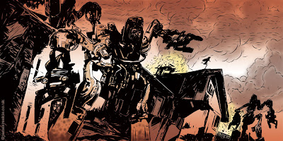
 Final spread for the book. Going to finalise the layout and organise a proof print.
Monday, 27 July 2009
Thursday, 23 July 2009
Wednesday, 22 July 2009
Tuesday, 21 July 2009
Colour Process
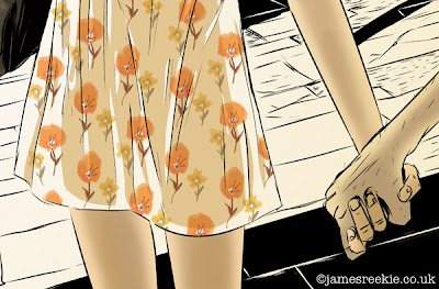 I thought I'd give you a little insight into the colour process that I've been using lately. I guess in general it's quite traditional, but interesting to me nonetheless. I was taught to paint "properly" during my degree and I'd recommend all students to learn traditional skills, even if like me, you work 100% digitally. All my work is created using the old school processes of reference gathering, tonal studies, etc, I just use a computer to speed it all up. And the computer has the blessed "undo" feature. Anyone who paints in ink and watercolour for real, I doff my cap.
This image is from the book I'm working on. Nearly done now! Couple more to go.
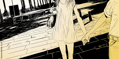
After Finishing the "ink" drawing in Manga Studio I drop a gradient layer straight across the image to create initial depth, tone and light. This layer is the final layer from the image, beefed up so you can see it clearer. As you can see I do alter some shapes as I go to get the colours right, generally after the next step.
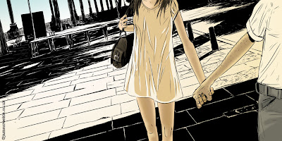 I then start adding colour in specific sections and digitally airbrush the tone on. Some areas get a "hard" treatment with the tone and colour, some soft depending on the light or the object or how I'm feeling, really!
I knew I wanted to play with pattern in this image, so I loosely worked up a flower design, again painted digitally in Photoshop. The check shirt was also done in this way, draw straight in the application using brush effects.
The final image. This is the longest section of the colouring process where I add things, delete them, delete existing things and generally mess around with different colours, hues and levels until I'm happy (these examples all come from the final file, the values were all quite different initially). The other thing I do is to shrink the image down to a thumbnail size in the view settings (a bit like walking back from the canvas to see full picture) so I can see how the tone works across the image.
And I ask the wife to tell me what she thinks. And then I stress about it. And then I stop.
Tuesday, 14 July 2009
Hollow
Friday, 10 July 2009
Thursday, 9 July 2009
Cover Concept
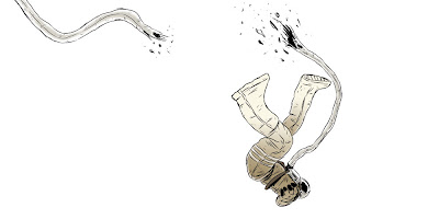 This is a concept for the cover of my picture book. Imagine a line down the centre with the back cover on the left and the front on the right. I was playing with some hand drawn type but it wasn't really working. Going to look at some typefaces now and see what works. I might well change the whole thing if I can't get the type to work with the image.
Wednesday, 8 July 2009
The Beginning
Tuesday, 7 July 2009
Shaky Start
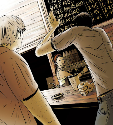 A shaky start to your first day on the job.
 Remember your first job? Mine was in a Fish 'n' Chip shop (how English!) as a "chipper and peeler" and lasted the sum total of about 8 hours as I never went back! Oh, and in case you're wondering, it wasn't chipping and peeling by hand, I had to carry the potatoes from one machine to the next in big buckets. By the end of the day my uniform was like concrete from all the starch! On the plus side I did get to have all the Fish and chips that I could eat! And we wonder why there's an obesity problem in this country...
Wednesday, 1 July 2009
IST "Untitled" by Interpol
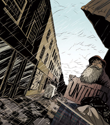 Here's my entry for this month, illustrating "Untitled" by Interpol. Check out the other entries and join in the general banter here.
Subscribe to:
Comments (Atom)


